Who it speaks to
Revenue leads at AI, robotics, sensing and data companies that sell to a few hundred named accounts, where a broad campaign spends its budget on people who will never buy.
As a marketer, I have always given brand a lot of weight, because it decides whether a buyer considers you at all and whether they still remember you when the time comes to buy. That is why I care about building brands properly, and this shelf is only the beginning: four brands I built or carried in 2026, from the first mark to the ads that carry it.
Want to reach out?
querovincent@gmail.comRevenue leads at AI, robotics, sensing and data companies that sell to a few hundred named accounts, where a broad campaign spends its budget on people who will never buy.
Torke reads as torque, the force that moves a heavy load. The mark chosen on 14 October 2026 is an internal ratchet, a part that turns forward and holds its position, which is what a pipeline should do.
Every text pair is one dark colour on one light one, so black on aquamarine reaches 16.07:1. Aquamarine covers 5 percent of a page, so wherever it appears it marks the next step.
Demand with momentum, picked on 15 October 2026 from 100 candidates, sits beside the headline Count the leads that count with Torke.

Demand with momentum
Brand book, 15 October 2026, v2.11
Torke speaks to the revenue lead at a robotics or sensing company who has watched a broad campaign spend its budget on people who will never buy. A company selling warehouse robotics may have 400 real accounts worldwide, while most marketing programs are built for 40,000, so the ad platforms never collect enough conversions to finish learning.
Torke is the company I set up for that smaller, heavier market, and its first site was built on 31 August 2026. The name reads as torque, the force that moves a heavy load, and the mark chosen on 14 October is an internal ratchet that turns forward and holds its position.
The tagline and the website headline were picked the next day, from 100 candidates.
Count the leads that count with Torke
We build and run distribution for companies that want to grow with intent rather than volume, and we measure our work in qualified leads our clients accept.
Growth services for B2B companies are a crowded field, and much of it looks alike, with a dark hero, a gradient and a promise of more leads. Torke had to look as if it could carry weight, so the identity borrows from machinery: the mark is a ratchet, the headlines are short and heavy in Sora 800, and the copy rules ban words like powerful and seamless.
A technical buyer used to agency decks meets pages that read closer to an engineering document, which is the register that buyer already trusts. Blush and white carry the page, black carries the type, and one aquamarine marks the single thing to do next.
Every pair that carries text is one dark colour and one light one, so each clears the 4.5:1 WCAG floor with room to spare.
| Aa | Black on Aquamarine, the main button | 16.07:1 |
| Aa | Ink on Lavender Blush, body text | 15.55:1 |
| Aa | Charcoal on Blush, secondary text | 6.02:1 |
| Aa | White on Aquamarine, banned | 1.31:1 |
The banned pair shipped once, as a menu hover on 16 October 2026, and the rule was written the same day. Aquamarine covers 5 percent of a page, so wherever it appears it reads as the next step.
#A9F0D1#E4D9FF#F7EBEC#595959#161616Aquamarine gets only 5 percent of any page, which keeps the signature colour working as a signal.


A rounded square holds an eight-tooth ratchet cut, the part that turns one way only. Charcoal or black sits on the light grounds, and aquamarine or white on black and charcoal, across seven colour files for every lockup.
The home page, captured live on 17 October 2026, opens on the headline Count the leads that count with Torke and one paragraph that defines the lead before any offer: a named person at an account you agreed, with a need in their own words.
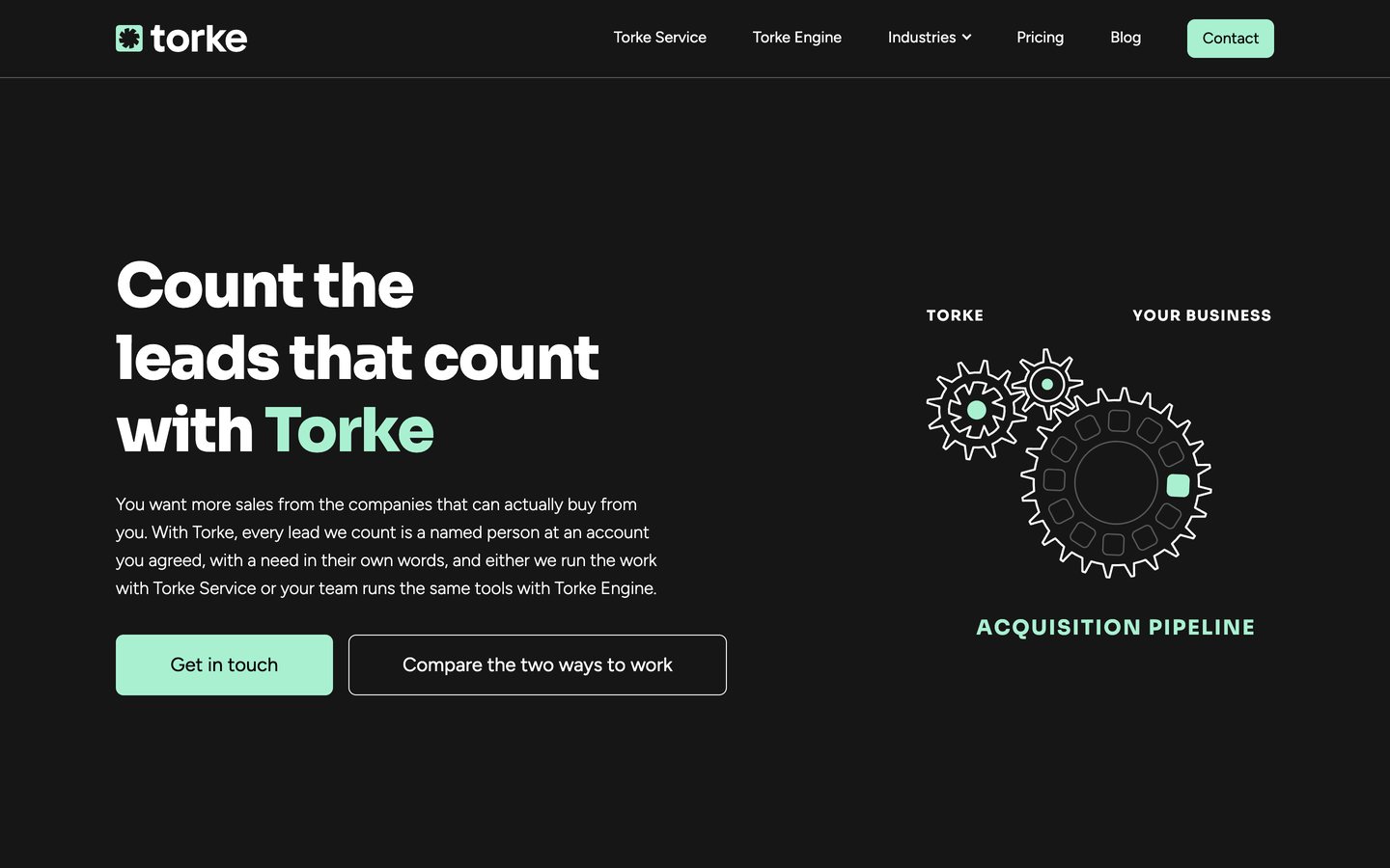
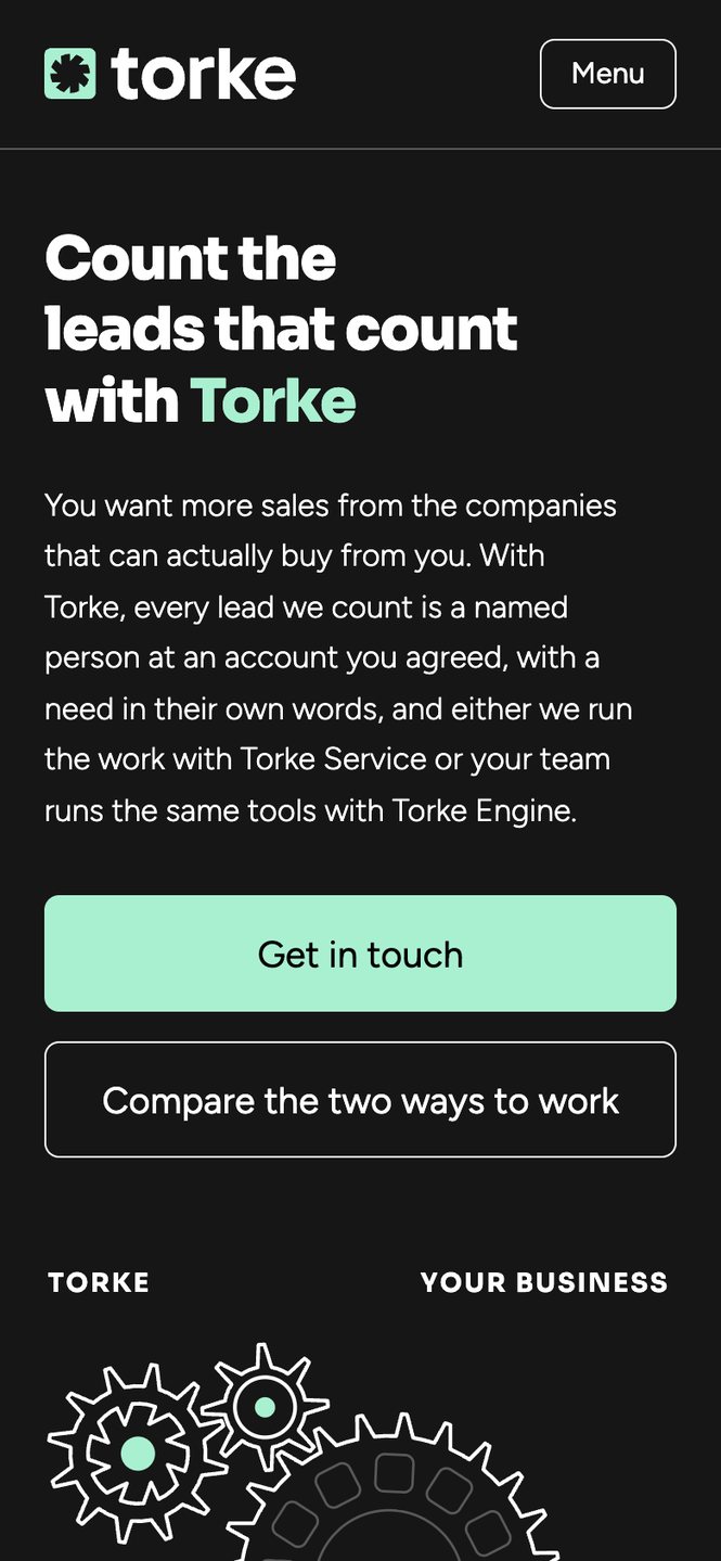
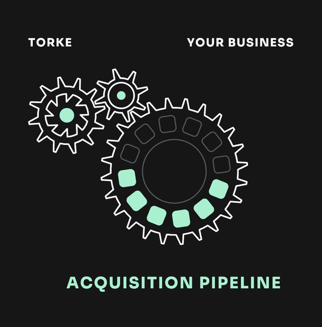
Each one shows the object its page is about, built from aquamarine circles, outlined rows and cards, like the meshing gears on the home page.
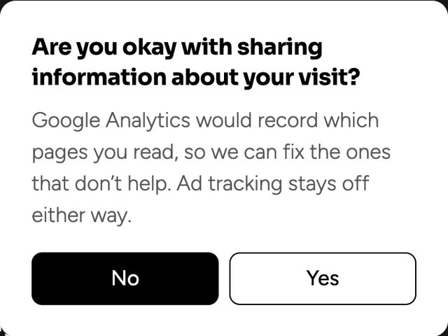
Visit torke.techThe drawing starts turning once it comes into view and winds up with every scroll, to six times its resting pace. Each of its twelve account cells lights up as it passes the qualifying point and stays lit, so the pipeline fills while you read. The consent panel, added on 17 October 2026, asks one plain question and keeps ad tracking off whatever the answer.
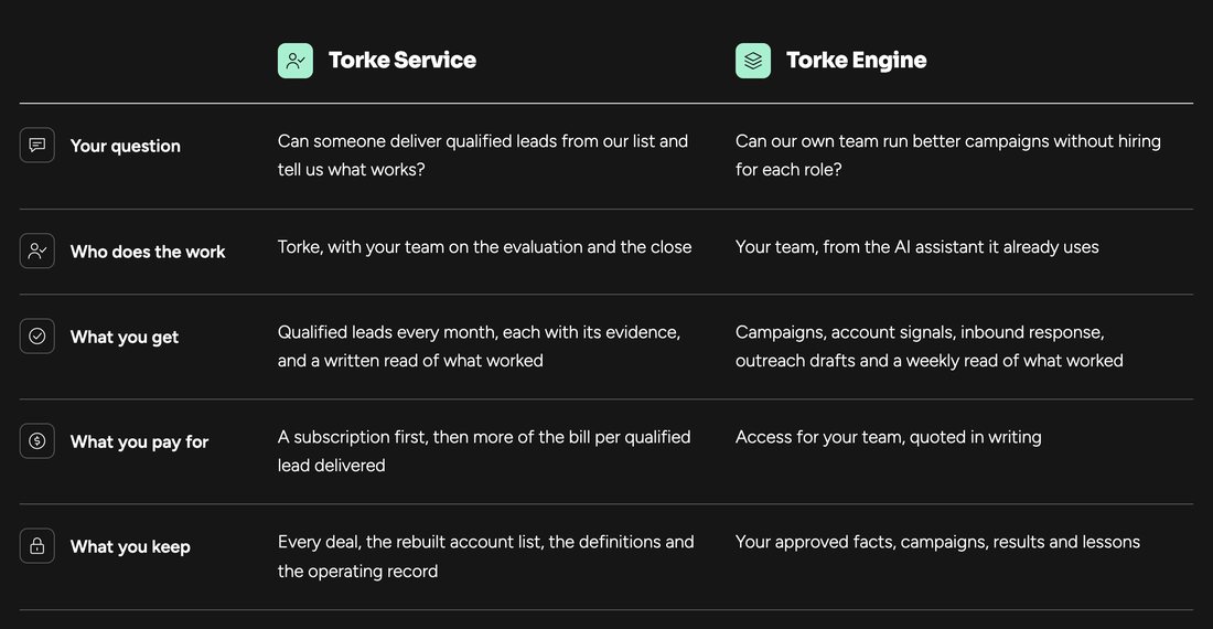
The comparison sets the two ways to work against the same five rows, from the question each one answers to what the client keeps at the end, with a drawn icon opening every row.
The LinkedIn banner and profile image, set on 15 October 2026, carry the line from the demand-gen article The week something changed is the whole pitch.
 Torke
Demand with momentum
Zurich, Switzerland
Follow
Set on 16 October 2026 from two lines on the website.
A company selling warehouse robotics may have 400 real accounts, while most programs are built for 40,000.
Two concepts set on 16 October 2026 for feeds that favour taller images, built from lines already on the website.
The same system at 1456 by 180, where only the mark, one line and one button survive.

Every format keeps the rules from the colour pages: one accent, one action, and type that holds its contrast at the smallest size.
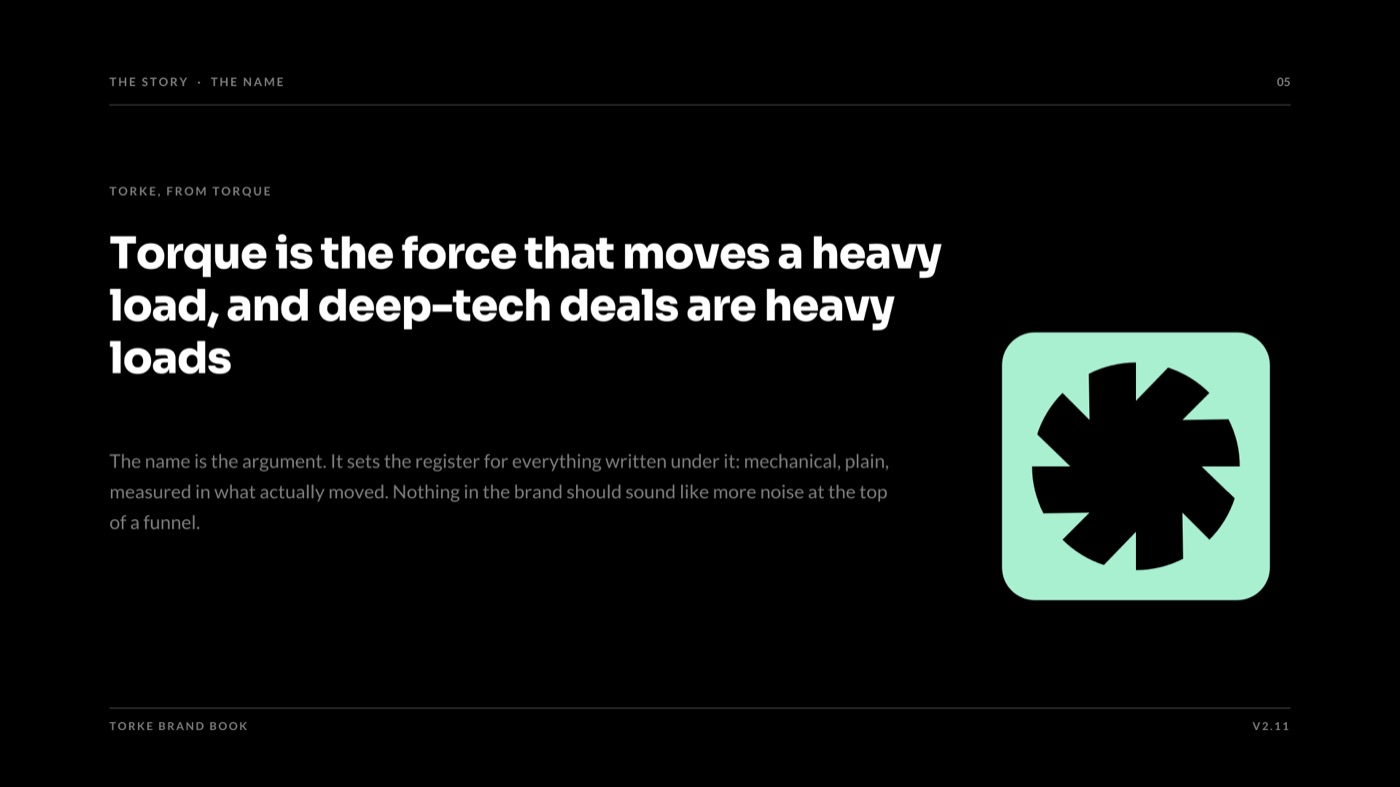
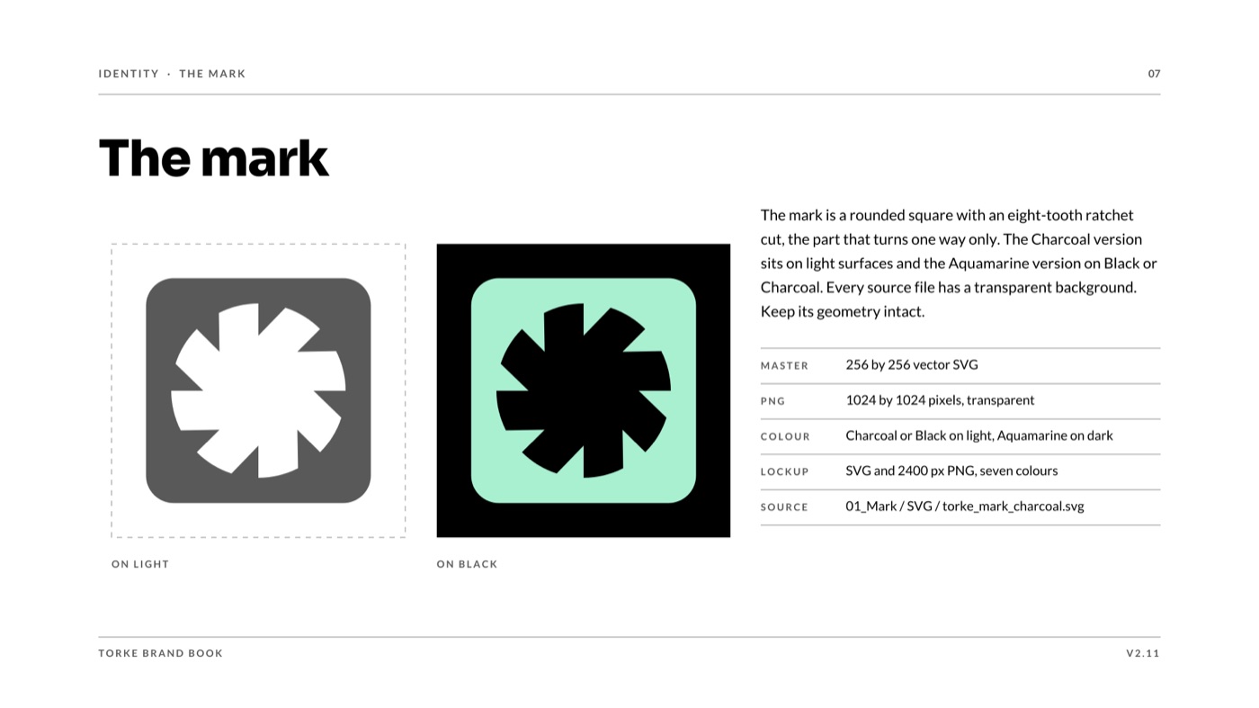
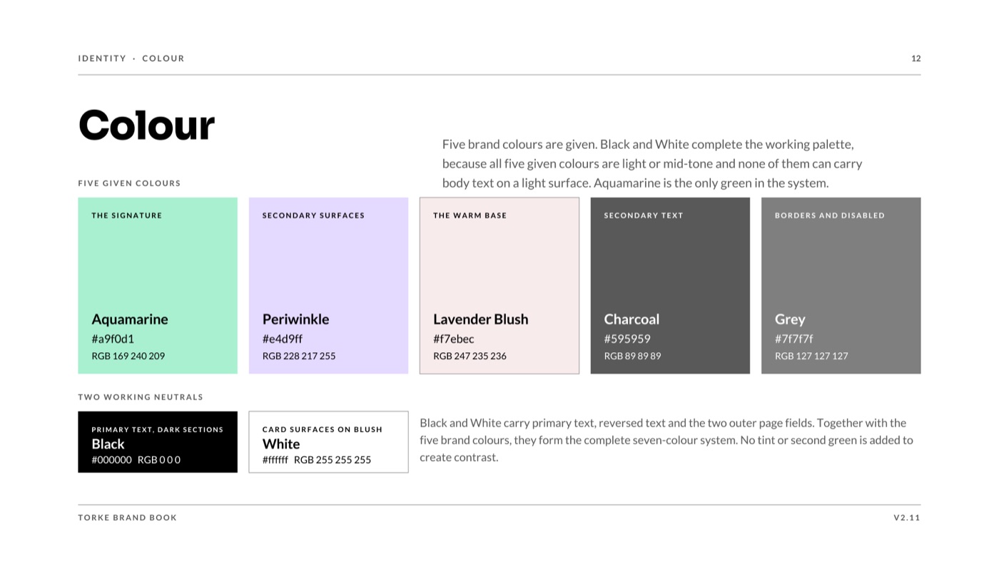
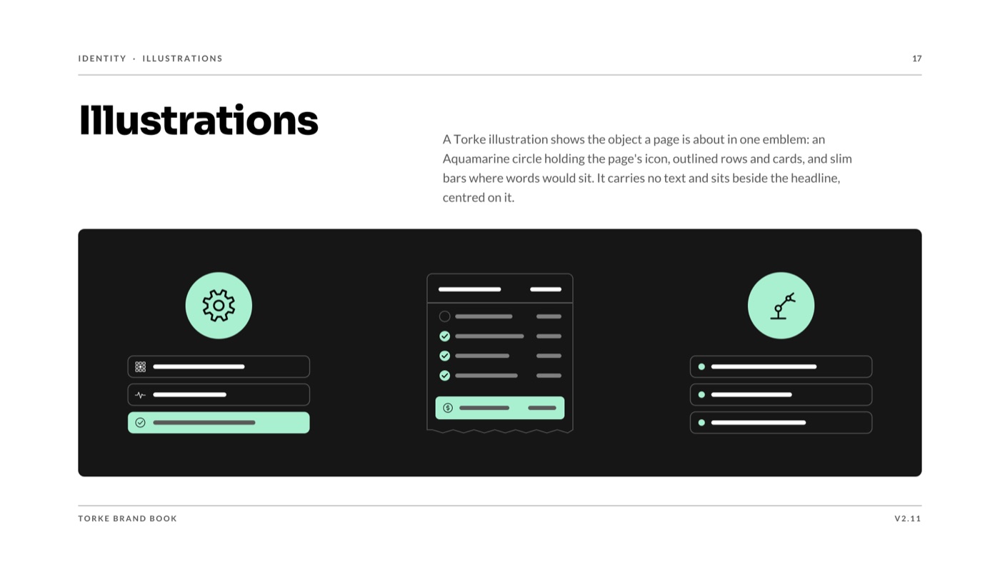
The name, the mark, the colour and the illustrations, from a book that ends on twelve checks every page passes before it ships.
Close the book, or open the next one on the shelf, Autobasket.
torke.tech
Drag the page corner, or press the arrow keys
Heads of e-commerce at mid-market shops with hundreds or thousands of products, who see the first orders arrive from AI assistants rather than from a search page.
The mark is a basket drawn in one continuous rounded stroke. That stroke sets every other shape in the system, which is why buttons are pills and cards carry a 20px radius.
Charcoal, Steel and Parchment keep the pages calm. One Tropical Mint marks the next action at 8.12:1 on charcoal, and never sits as text on a light ground, where it falls to 1.37:1.
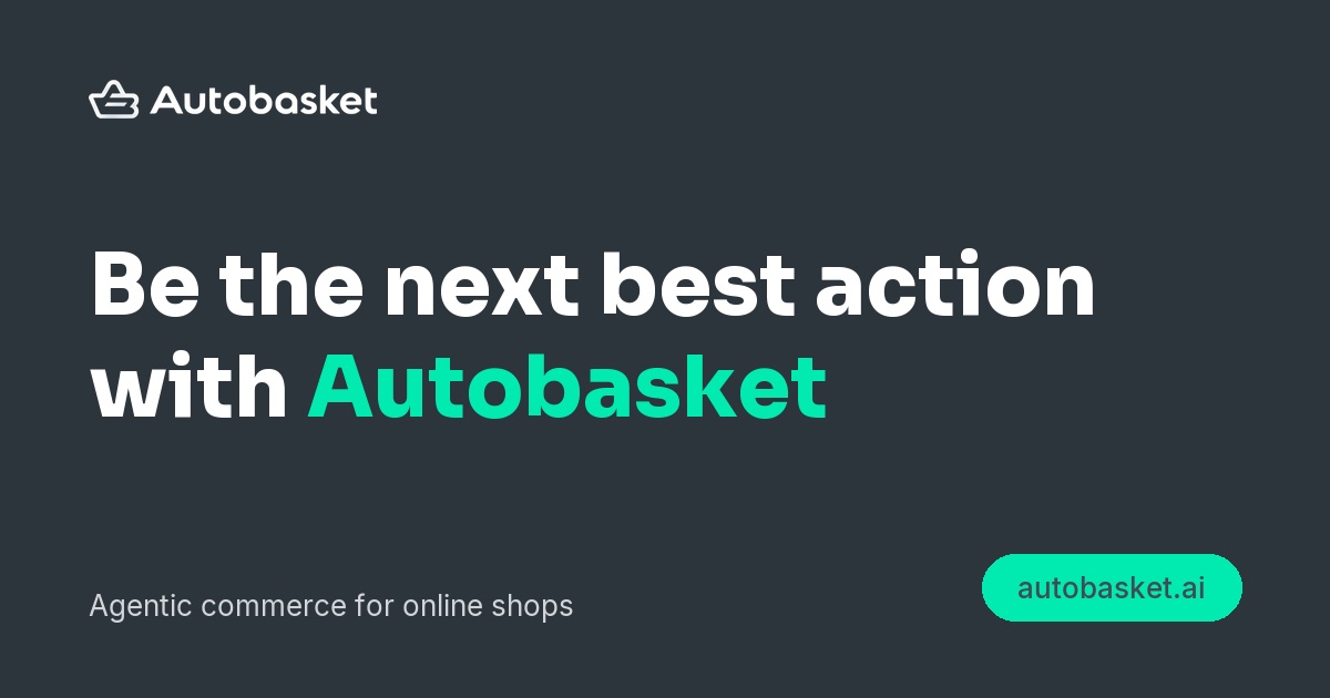
Be the next best action. Autobasket kept the line when it took over Neurock's agentic commerce work in September 2026, because the job stayed the same.

Be the next best action
Design system, v2.0.0
Autobasket speaks to the head of e-commerce at a mid-market shop with hundreds or thousands of products. A purchase used to start with a search and end on a checkout page. Now it often starts with someone describing a problem to ChatGPT, Perplexity, Claude or Gemini, and the assistant compares the options and sometimes places the order.
Autobasket opened on 22 September 2026 to prepare online shops for that buyer. It took over the agentic commerce work Neurock had started and kept the line Be the next best action, because the job stayed the same.
Found, trusted, bought
Autobasket exists so that the shops people would pick for themselves stay in the answer when an assistant does the picking.
AI commerce is often sold with glowing robots and violet gradients, and a merchant who signs off on checkout changes has learned to distrust both. Autobasket went the other way, with Charcoal, Steel and Parchment on almost every surface and the brief's principle Calm by default setting the tone.
The single Tropical Mint is kept for the next action, so a shop owner scanning a page finds the button before the copy. The round stroke of the basket mark sets every other shape, which is why buttons are pills and cards carry a 20px radius.
Tropical Mint is bright enough to read as a light colour, so it only carries text on the dark charcoal bands.
| Aa | Mint on Charcoal 800, links and accents | 8.12:1 |
| Aa | Charcoal 700 on Mint, button labels | 5.71:1 |
| Aa | Charcoal 700 on Parchment, body text | 7.80:1 |
| Aa | Mint on Parchment, banned | 1.37:1 |
On a light ground the mint falls to 1.37:1, which is why the system says mint is never text on a light ground and why a mint button always carries a charcoal label.
#01EBB0#2C343C#A2AEBB#F5EFEDOn 16 October the palette moved to Charcoal, Steel and Parchment around one mint, with two rules that keep the mint legible: it is never text on a light ground, and a hover never puts white text on it.

The mark is a basket drawn in one continuous rounded stroke, and that round stroke sets the shape language of every button and card. Five lockups in three colours, plus app icons.
Open the design system in Figma
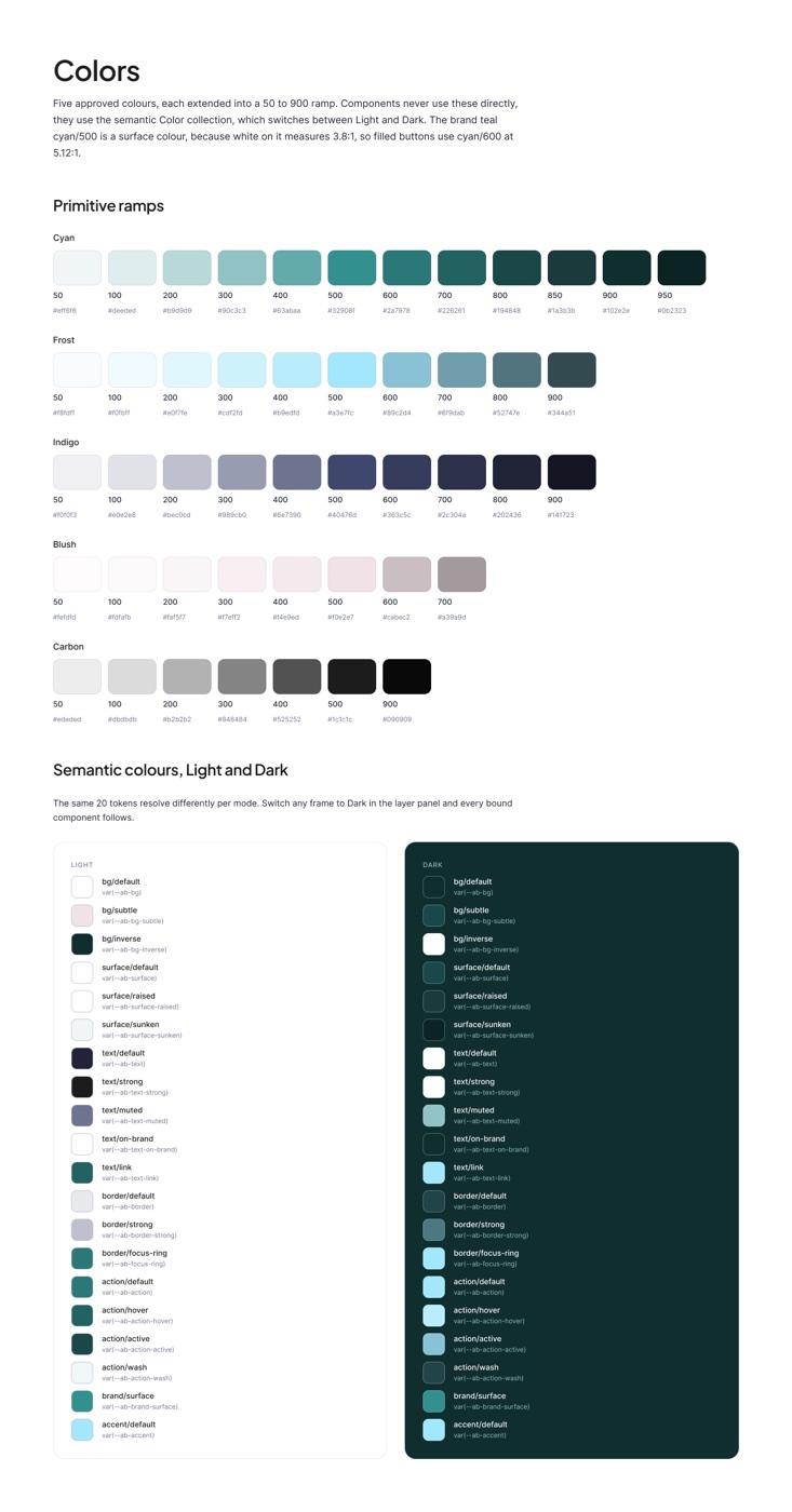
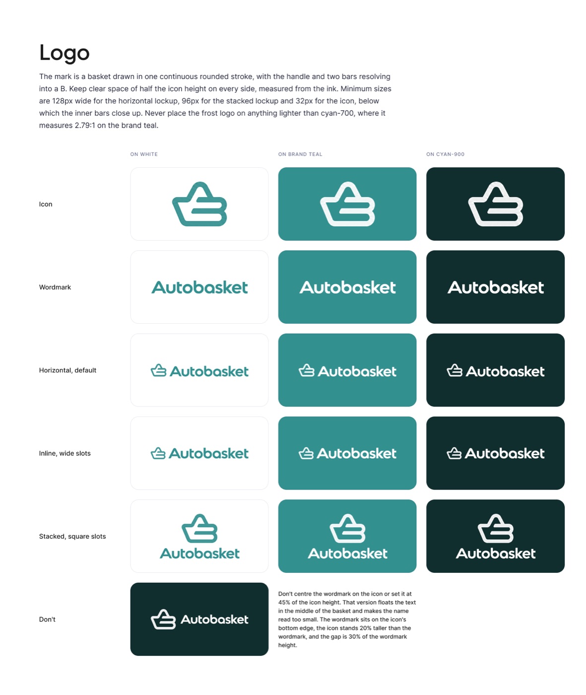
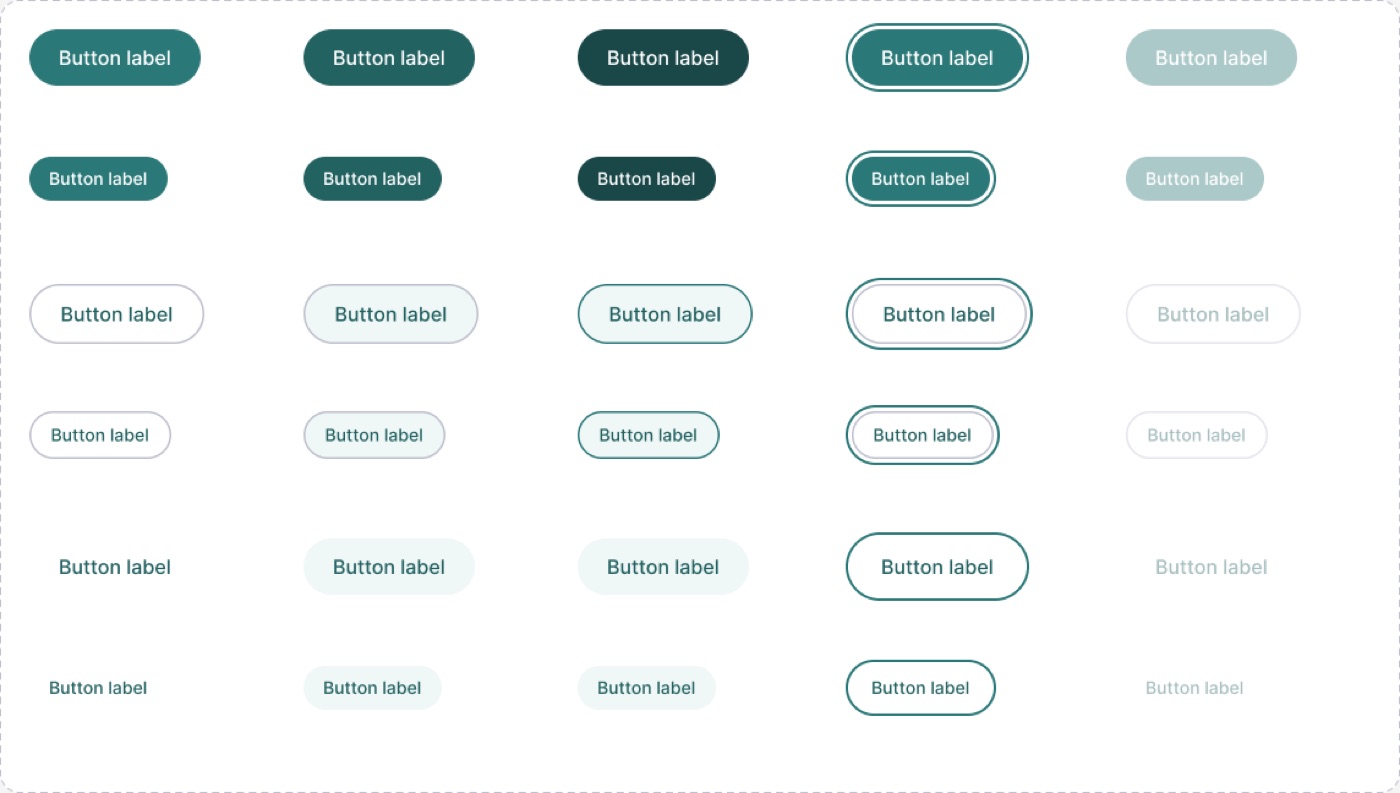
Colour, type, spacing, radius, elevation, logo and the Button, Input and Card components, locked at v2.0.0 on 16 October 2026.
The Astro site serves people and assistants at once, with an llms.txt file, a Markdown mirror of every page and structured data.
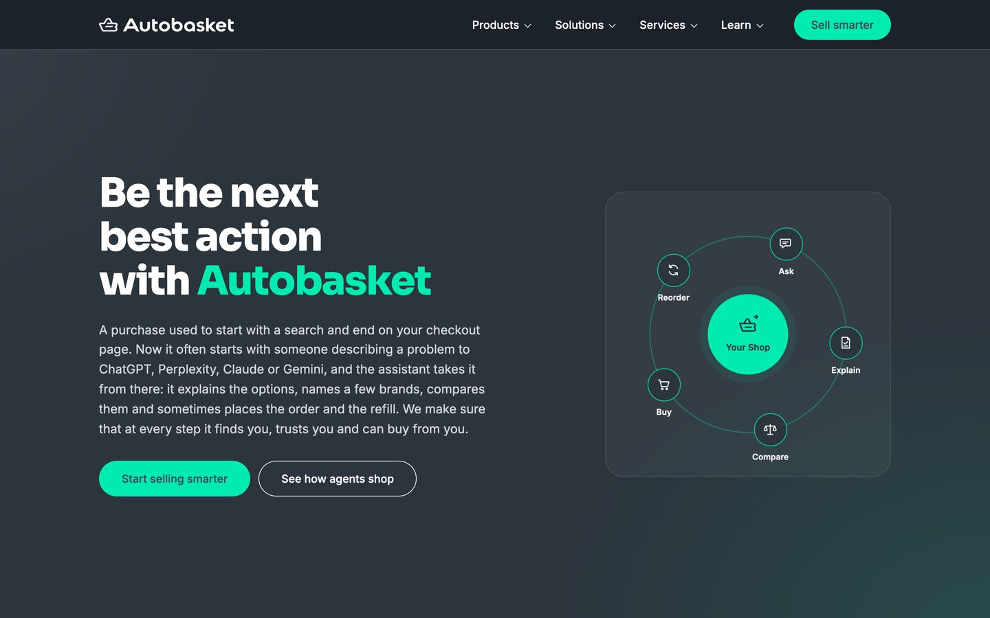
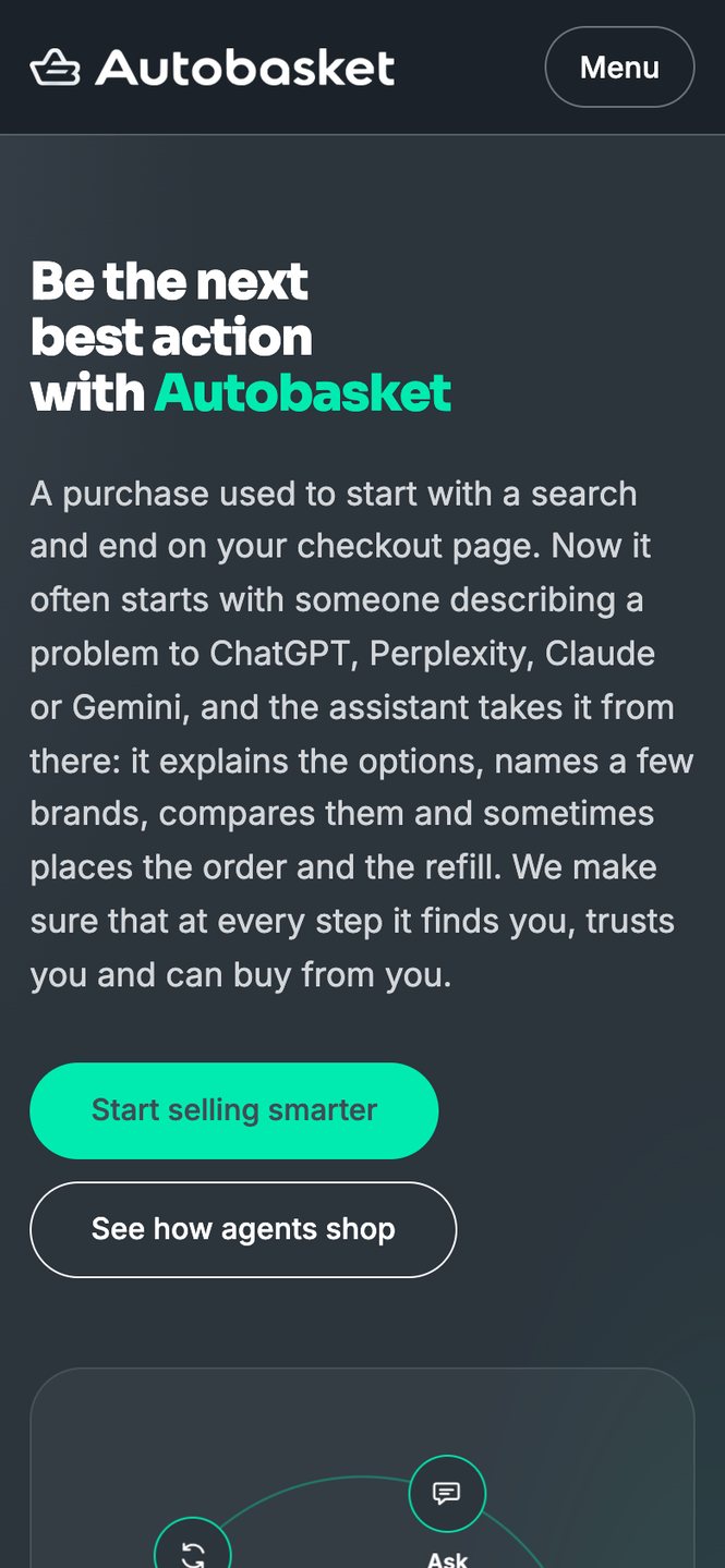
The domain autobasket.ai still did not resolve on 17 October 2026, so both screens come from that day's production build of the site, served locally.
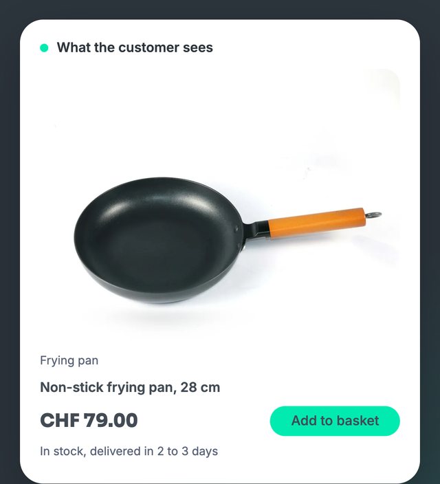
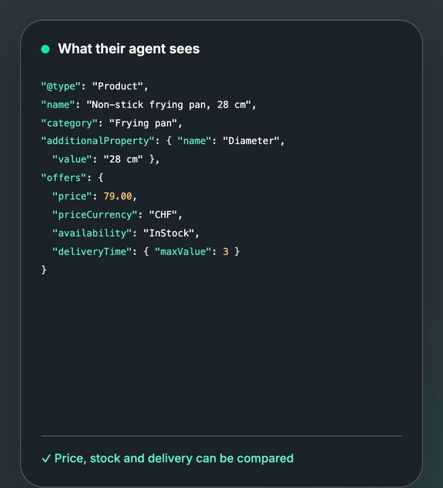
The hero card shows a product as the customer sees it, then flips to the Product data their AI agent reads: name, category, price in CHF, stock and delivery time. It holds each side for about four seconds before the next product comes in, and a click flips it by hand.
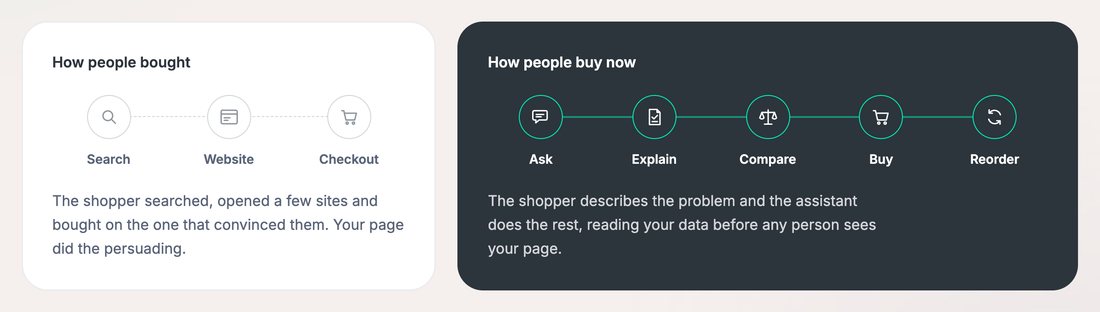
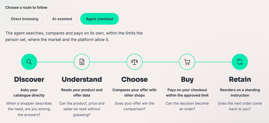
The first widget sets search, website and checkout against the five steps people follow now, from asking an assistant to the reorder. The second lets the reader pick direct browsing, AI-assisted or agent checkout, and rewrites every stage for that route.
The default share image travels with every link to the site, into a feed, a chat or an email preview.
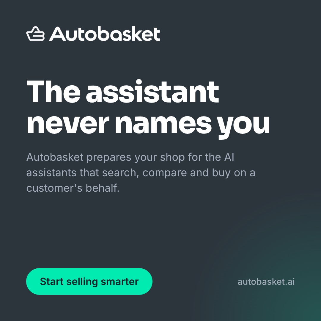
Set on 16 October 2026 around a finding the website publishes.
Make your products the ones agents can buy.
Two concepts set on 16 October 2026 for feeds that favour taller images, built from lines already on the website.
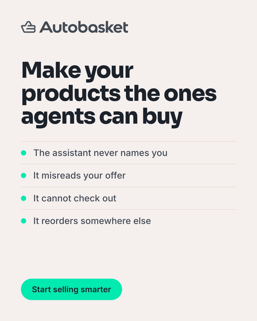
The same system at 1456 by 180, where only the mark, one line and one button survive.

Every format keeps the rules from the colour pages: one accent, one action, and type that holds its contrast at the smallest size.
Close the book, or open the next one on the shelf, Quanthome.
autobasket.ai
Drag the page corner, or press the arrow keys
Institutional investors who sign off on real estate allocations. Practically speaking, they look for the source behind a figure before they read the claim around it.
The logo carries no symbol, only the name. In practice, the name sits in the same tone as the figures beside it, so nothing on the page competes with the data.
Brand Book v1.0 sets Ink, Paper and Quiet at a 72, 24 and 4 ratio, with no fourth grey. Ink on Paper reaches 21:1, the highest contrast a screen can show.
The Science of Sage Choices. The decision stays with the reader, and the method behind it is shown.

The Science of Sage Choices
Quanthome is read by institutional investors who sign off on real estate allocations and have been sold enough software to be wary of the next pitch. It computes ESG and portfolio metrics from public data, which allows it to score funds that do not report to GRESB or REIDA. I worked there as Head of Growth on a consulting basis from March to August 2026, inside a brand that already existed.
Practically speaking, my brand work was to apply its system to every report, email, audit and outbound sequence growth produced, without adding a fourth grey or a louder sentence.
The Science of Sage Choices
We bridge real estate and AI so you don't have to.
The voice is a trusted senior advisor, held to five words: calm, precise, human, bridging and enduring.
In practice, a finding comes first, with its scope and its source, and what it means for the reader follows in plain words.
The earlier tagline, Accessible AI for Swiss real estate, was retired on 7 July 2026, when the positioning moved to a multinational platform with local presence in each market.
Real estate data products often arrive in navy and gold, with a glass tower on the cover. Brand Book v1.0 set Quanthome a narrower rule: Ink, Paper and Quiet in a 72, 24 and 4 ratio, with no fourth grey.
In practice, the colour never competes with the figures, so the eye goes to the number and its source, which is where an institutional reader looks for a reason to trust it. The slogan makes the same promise in words: the decision stays with the reader, and the method behind it is shown.
Ink on Paper is the highest contrast a screen can show, and the approved tones stay close to it.
| Aa | Paper on Ink | 21:1 |
| Aa | Quiet on Ink | 19.26:1 |
| Aa | Label grey on Ink | 6.49:1 |
| Aa | Label grey on Paper, labels only | 3.23:1 |
Practically speaking, the label grey passes on Ink and falls under 4.5:1 on Paper, which suits a short label set large and would not suit a paragraph.
Brand Book v1.0 sets Ink #000000, Paper #FFFFFF and Quiet #F5F5F5 at a 72, 24 and 4 ratio, with one sanctioned label grey, #8F8F8F.
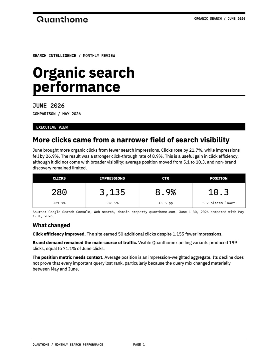
June brought more organic clicks from fewer search impressions. Clicks rose by 21.7%, while impressions fell by 26.9%.
Average position is an impression-weighted aggregate. Its decline does not prove that every important query lost rank.
In practice, every figure in the monthly report is followed by what changed and by what the figure does not prove, so each figure reaches the reader with its limits already attached.
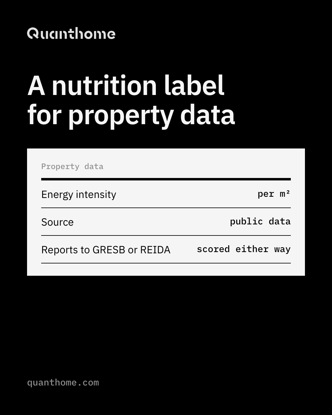
Set on 16 October 2026 from the image the team used to explain the product.
Scores for funds that report to GRESB or REIDA, and for those that do not.
Two concepts set on 16 October 2026 for feeds that favour taller images, built from lines already on the website.
The same system at 1456 by 180, where only the mark, one line and one button survive.

Every format keeps the rules from the colour pages: one accent, one action, and type that holds its contrast at the smallest size.
Quanthome is the one brand here I did not design, and it sits on the shelf to show the other side of the work, applying a system someone else set without bending it.
The last book on the shelf is Neurock, the brand Autobasket grew out of.
Drag the page corner, or press the arrow keys
Brand owners in Switzerland and Europe who watch buyers move from Google to AI assistants and fear becoming invisible.
An eight-spike star sits beside lowercase neurock in Sora ExtraBold. The brand book calls it the answer at the centre, a signal that lights up when an AI names the brand.
Neurock Yellow on Deep Navy reaches 17.02:1. The palette is closed at four colours with no reusable grey, so an ad, a cover and the website all read as Neurock from a thumbnail.
be the next best action, in lowercase, carried by a voice where every sentence is clear enough for a machine to quote and trustworthy enough for a buyer to believe.

be the next best action
Brand book, 2026, v3.8
Neurock speaks to brand owners who watch buyers move from Google to AI assistants and fear becoming invisible. In June 2026 those buyers had started asking ChatGPT and Perplexity which supplier to call, and the brands those assistants named were often the ones with the most readable pages, whether or not they had the best product.
I built Neurock to fix that for Swiss and European brands, so its own brand had to pass the test it sells. The foundation, mission and voice were written on 23 June, the brand book grew from 17 pages in July to 21 pages at v3.8 on 27 August, and the design system reached v3.23 on 23 September.
When agentic commerce left Neurock in September, it became a brand of its own, Autobasket, the second book on the shelf.
be the next best action
We make sure the brand that deserves the sale is the one AI assistants name and agents purchase.
Every sentence is clear enough for a machine to quote and trustworthy enough for a buyer to believe.
AI visibility services multiplied through 2026, and many borrowed the look of AI product sites, with violet gradients, glass panels and a sparkle icon. Neurock needed to be recognisable as a thumbnail in a feed, so it paired an acid yellow rarely seen in the category with a deep navy, and drew an eight-spike star that reads as an answer lighting up.
The voice runs the other way: plain-spoken, precise and quietly certain, so the colour gets the brand noticed and the sentences get it believed.
The design system locks the rule as measured, not judged: every approved pair is one light colour on one dark one.
| Aa | Neurock Yellow on Deep Navy | 17.02:1 |
| Aa | Electric Cyan on Deep Navy | 13.67:1 |
| Aa | Deep Navy on Paper | 16.8:1 |
| Aa | Yellow on White, banned | 1.09:1 |
Every pair that fails is two light colours together, which is why the yellow never meets white and the palette keeps no grey to fall back on.
#101417#00F5FF#F6FF47#F4F4F1The design system states it plainly: the palette is closed, and there is no reusable grey in this brand.

An eight-spike burst star sits beside lowercase neurock in Sora ExtraBold 800. The lockup is horizontal only, and the system ships no stacked version.
Open the component library in FigmaThe website runs in English, German, French and Italian across 140 pages, and the home page opens on the hero line Be the Name in the Answer.
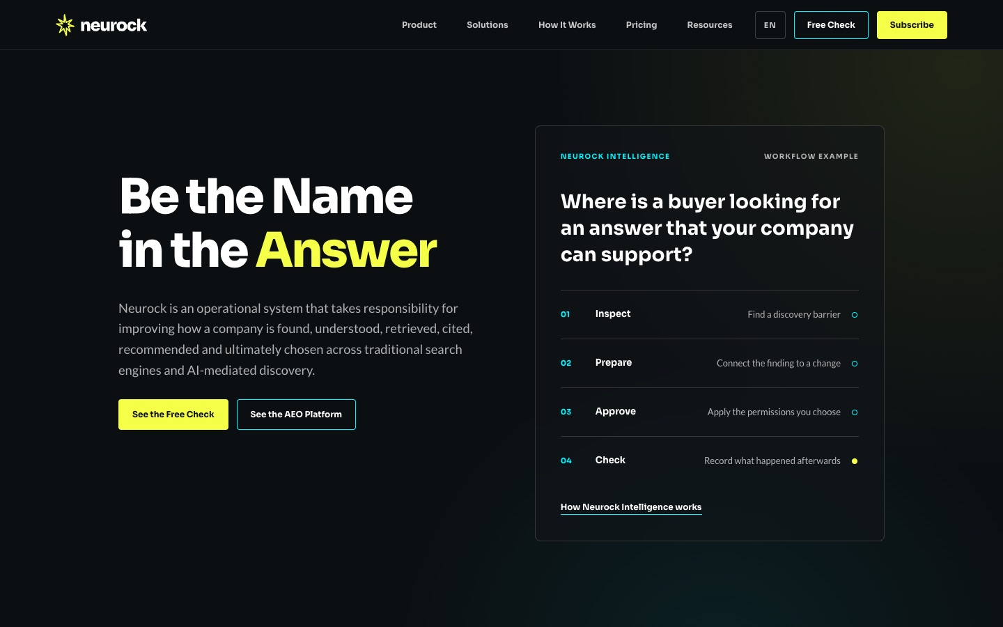
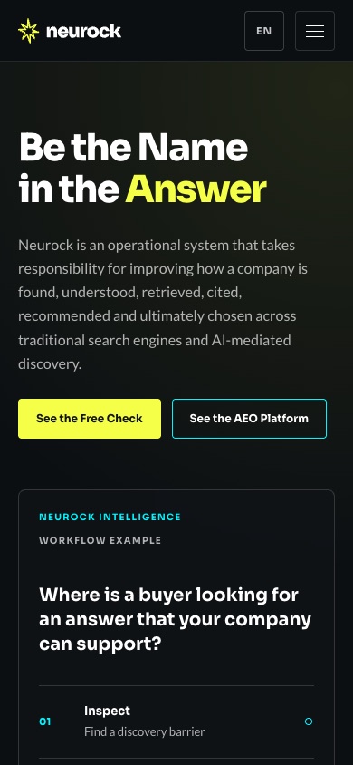
The phone layout keeps the yellow and cyan button pair and the workflow card, so the first screen still says what Neurock does before anything is scrolled.
Visit neurock.chEach of the six, produced on 30 July 2026, names one buyer problem and sends people to the answer test.

Neurock tests the category questions buyers ask AI.
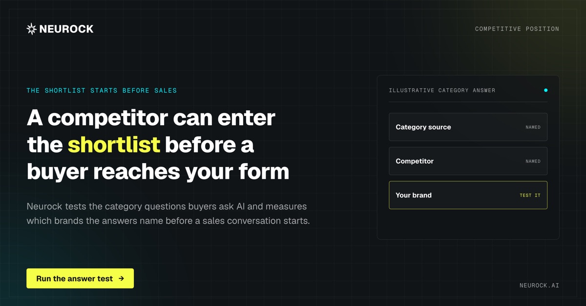
From the LinkedIn round of 29 June 2026, the ad that put the canonical line Citations beat clicks in front of buyers.
Search engines position pages. Answer engines quote sentences.
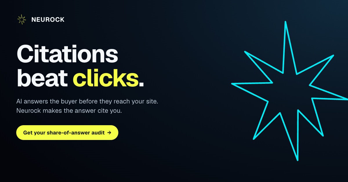
The LinkedIn banner, rebuilt on 26 October 2026 in Sora and Lato, carries the tagline be the next best action and keeps the left side clear for the profile mark.
 neurock
be the next best action
Marketing Services
Follow
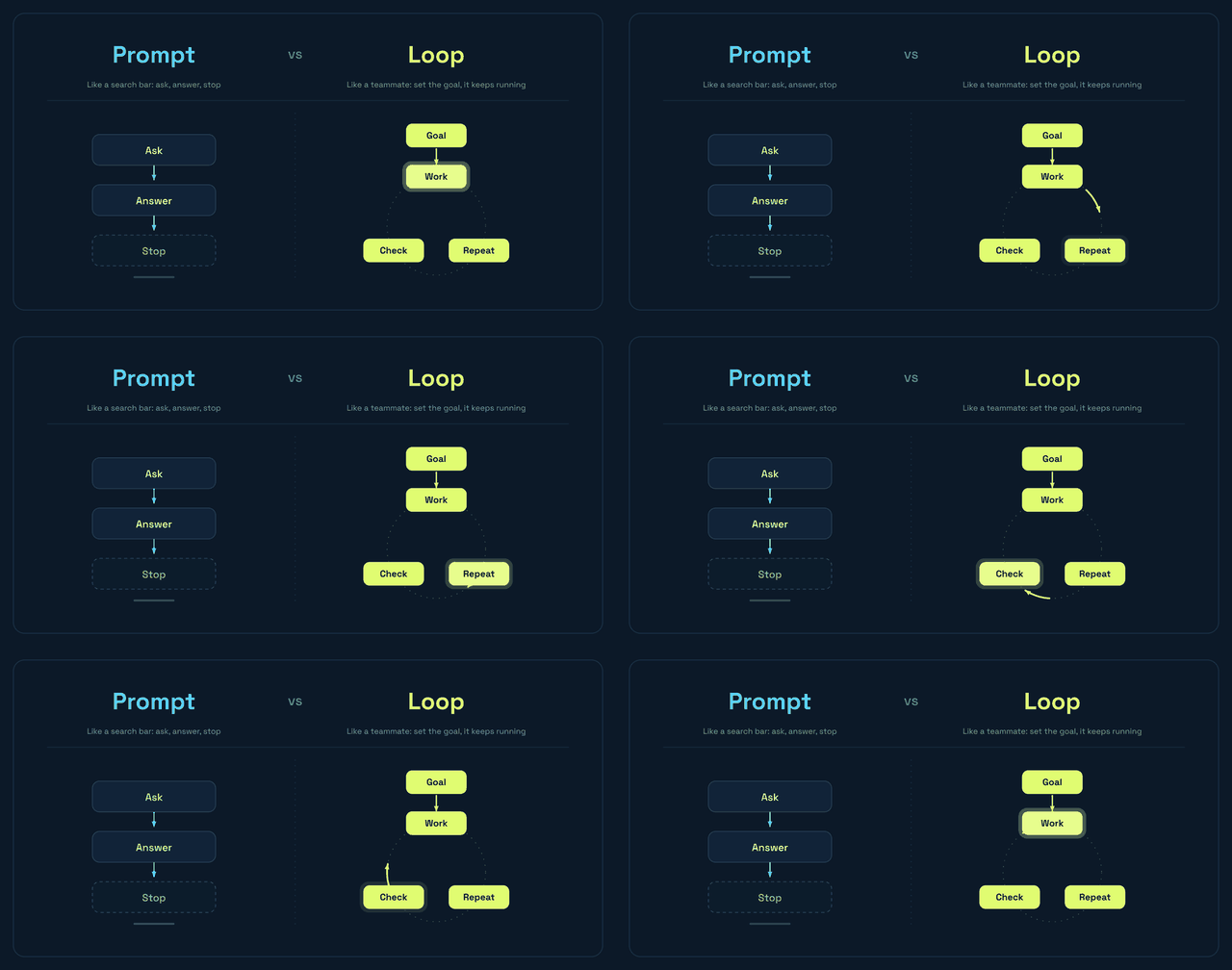
A looping visual from 24 June 2026, made for posts where a diagram explains the idea faster than a sentence: a prompt stops after one answer, while a loop keeps working toward a goal.
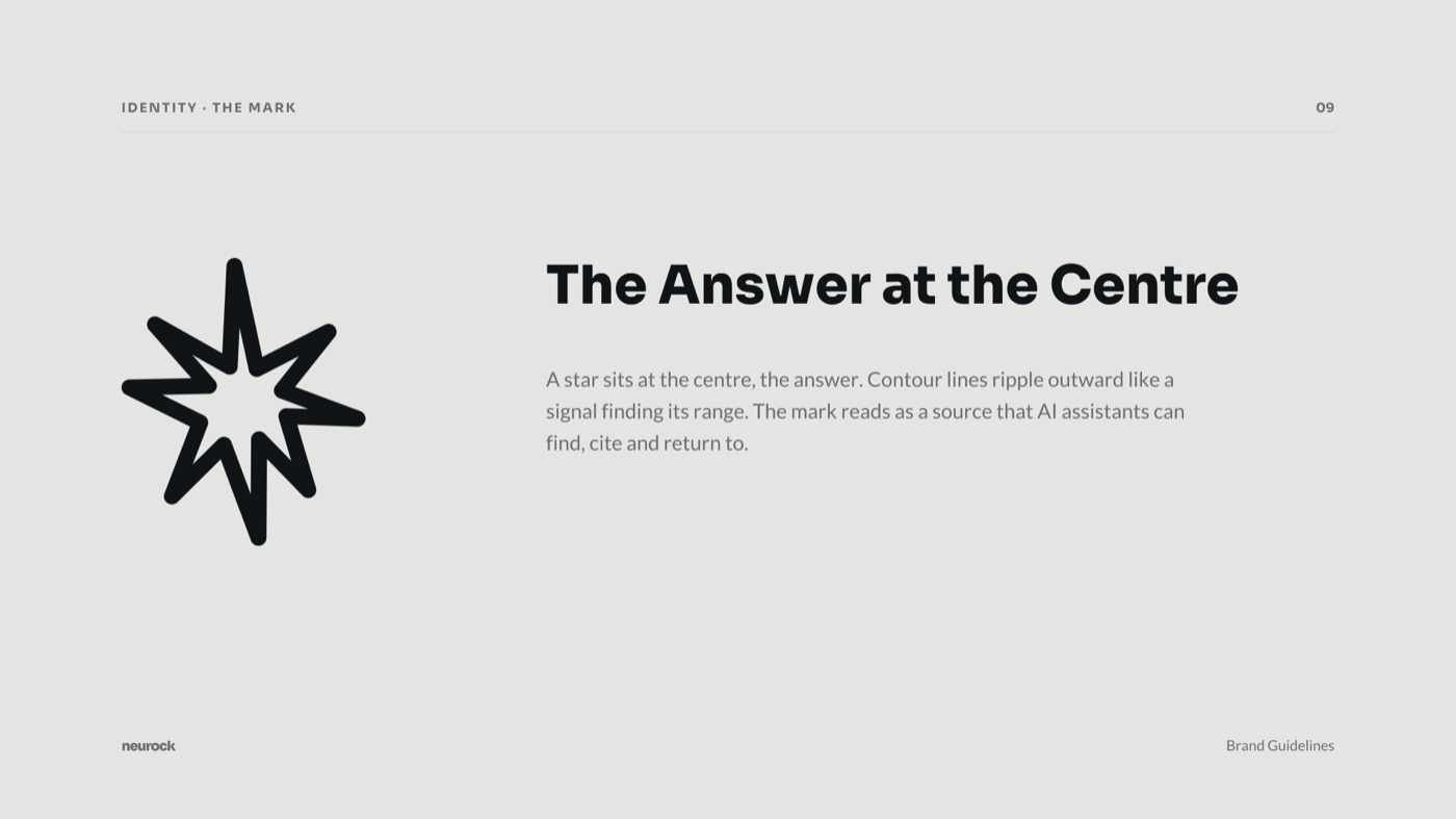
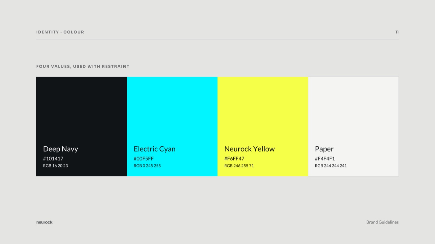
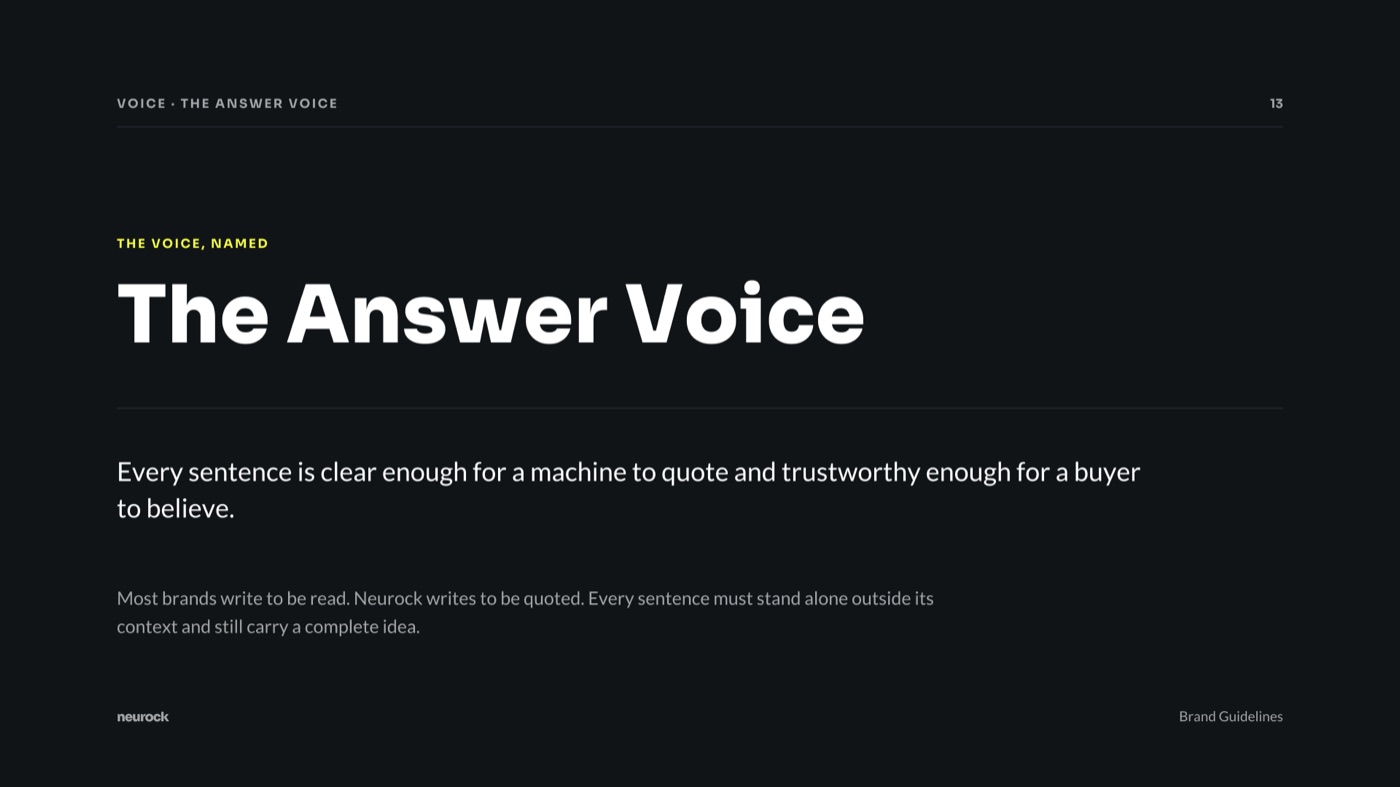
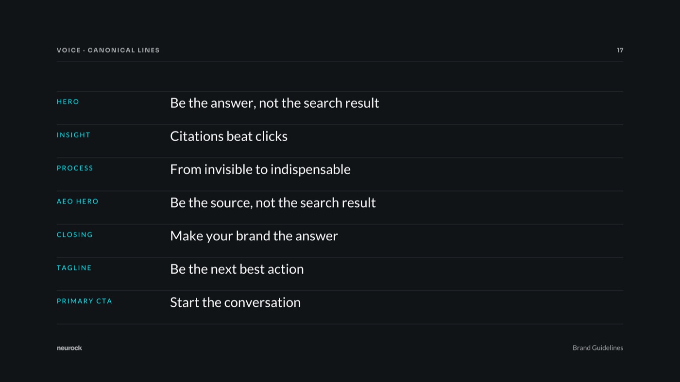
The mark, the colour, the Answer Voice and the canonical lines, four of the 21 pages that also cover positioning, the LinkedIn system and the website specification.
Close the book to go back to the shelf, where a closing note sets out what the four books have in common.
neurock.ch
Drag the page corner, or press the arrow keys